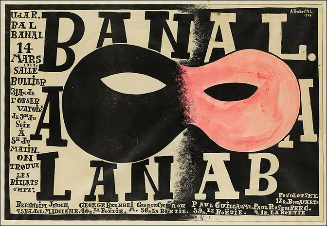
Alexey Brodovitch or better known as the man behind Harper’s Bazaar for nearly a quarter of a century. Played a crucial role in bringing modern styles from Europe in the 1920’s to the United States. Brodovitch was born in Ogolitchi, Russia in 1898 to a wealthy family. In youth Brodovitch fought in the White Army. This decision forced him into exile. He moved to Paris and started his artistic career as a scene painter. During his time in Paris he was exposed to several different art new movements such as Bauhaus, Constructivism, Dadaism, and Futurism. Despite the burdens of being exiled, he thrived in his new home. In 1924 he entered a poster competition which searched for the most innovative design to announce an upcoming ball. He won first prize, and in 1925 he won several medals for other competitions. This brought him to the attention of various designers and agencies in Paris.
Although Brodovitch is known for many things he is most famously known for his designs of Harper’s Bazaar. It all began when the Art Directors Club of New York asked Brodovitch to design their “13th Annual Art Director Exhibition” at the Rockefeller Center in New York. Caramel Snow, the editor in chief of Harper’s Bazaar saw Brodovitch’s work and knew he was the one to convert the magazine into something innovative. As Snow stated in her book “I saw a fresh, new conception of layout technique that struck me like a revelation: pages that bled beautifully cropped photographs, typography and design that were bold and arresting. Within ten minutes I had asked Brodovitch to have cocktails with me, and that evening I signed him to a provisional contract as art director. (The World of Carmel Snow: P90) Everyone who watched Brodvitch work was left amazed. Frances MacFadden, the managing editor at Bazaar described Brodovitch as swift and sure in his work.
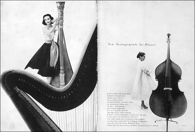
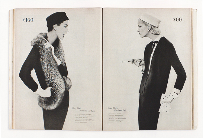
At the time Brodovitch wanted his style of magazine to be innovative and fresh. Contrary to magazines at the time who were taking a more contemporary approach to their designs. Magazines found it important to include and show off images of the whole garment, Brodovitch would cut images and make them asymmetrical to bring a new dimension to the layout of the cover. He would utilise forms already present in photographs to be a part of or even create the text. In terms of photography, Brodovitch knew what the magazine needed. He preferred on location photography opposed to studio shots normally used in other fashion magazines. He wanted his photographers to look for juxtapositions in their images. He did this by constantly repeating a pose or a dress several times across a spread to give a temporal feeling. At times, Brodovitch would randomly take a series of photographs and adopt a storyline to go with them, as though recapping a movie. With this goal of storytelling Brodovitch turned Harper’s Bazaar into a mediascape. Creating a reality for the imagination of the readers.
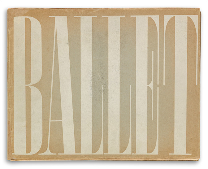
Additional works by Alexey Brodovitch:
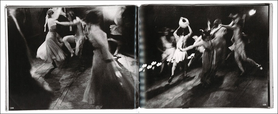
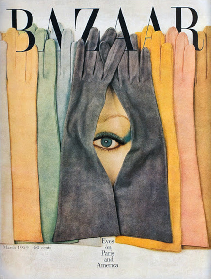
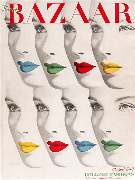
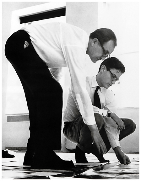
For additional information on the aesthetic practice of Alexey Brodovitch:
Icon of Graphics – http://www.iconofgraphics.com/Alexey-Brodovitch/
Design History – http://www.designishistory.com/1940/alexey-brodovitch/
Harper’s Bazaar – https://www.harpersbazaar.com/culture/features/a94/bazaar-140-0607/
The Art Story – https://www.theartstory.org/artist/brodovitch-alexey/
Writing by Liliana “Lili” Gomez. Lili is a junior graphic design major with interest in 20th century art direction and magazine design. In her spare time she enjoys travel, doing outreach projects with her sorority, and following the ever-changing fashion design developments of our contemporary visual culture.


