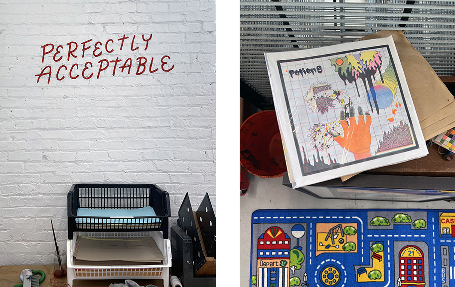
Publishing books can be a complex, difficult, and lofty task. Beyond creation of interesting and timely work, there is the need to understand the process and tools for execution. There is also the need to locate a publisher who understands one’s vision and wants to support this effort. Matt Davis runs Perfectly Acceptable Press and Risograph Studio in Chicago’s Pilsen neighberhood. The focus here is upon independent artist’s publications, specifically Indie comics and experimental narrative driven explorations. This week The COMP Magazine travel to the near south side to discuss with Davis his interest in the Risograph process, his connection to Chicago’s independent comics community, his shift from producer to facilitator/publisher, and what he is currently working upon.
Your connection to independent comics and zines is informed by several seemingly disparate elements/events. You are from Connecticut and came to Chicago after studies at Oberlin College in Ohio. There you completed your thesis by translating a Chris Ware graphic work into Russian. Can we start with you sharing with us any other personal experiences or people that prompted you to focus on publishing independent works?
When I was a kid I was super into computers – I started using old MS-DOS machines on my Dad’s lap when I was about 3. Starting around age ten I got into designing websites. Through that experience I became interested in design. I taught myself Photoshop, Illustrator, and InDesign; generally sharpening my design instincts as I went. I was transfixed & completely obsessed – I would never do my homework, always choosing time spent on the computer. My grades suffered but at the time I didn’t really care that much.
Eventually, though, by late High School, I drifted away from computers, finally realizing I should engage more with ‘real life’ and, also, my homework (to the relief of my mom, especially). I doodled in class, but that was about it for keeping up my arts practice.
By Sophomore Year of College I was completely miserable – I had somehow ended up a Economics Major and had no artistic outlets to speak of. Thankfully, that changed when a girl I had a crush on told me she was taking a class in the Creative Writing department called ‘Graphic Narrative’ taught by Dan Chaon. I signed up immediately.
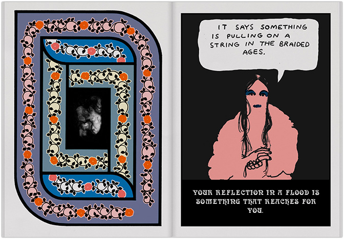
Dan structured his class around reading comics (mostly of the ‘Graphic Novel’ variety) and then writing our own free-form response comics to our reading. He was a truly fantastic teacher and accommodated all levels of artistic ability (I was a designer by some metrics, but an artist by very few). The class ended up being a huge release for me. Finally I had outlet where I could practice design, doodle, AND get good grades for it. The girl and I also started dating. The combination just sort of re-oriented my whole world. It was too late to switch to a Creative Writing major, but I was able to complete a minor. I was able switched to a Russian Language major, though, which was way more bearable than Econ, and something I was able to eventually parlay into involving comics, too.
I should mention two other people who were influential to me around this time:
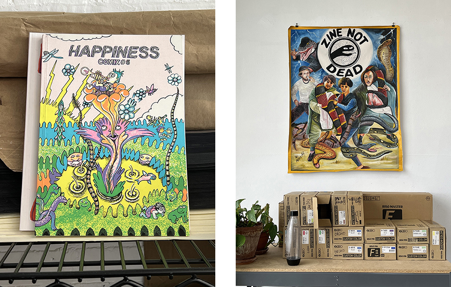
1) MJ Robinson was one of my best friends at Oberlin and with whom I started the Oberlin Comics Collective. The Comics Collective (OCC) became the place where I truly learned about small press publishing – and where I first encountered a Risograph. I had first heard of Risos via cartoonists like Mickey Z and Patrick Kyle, but finally got to use one myself when MJ found one in the back of the local UPS Store, old, neglected, but mostly functional, and gladly took it off their hands for a hundred dollars or so. Beyond connecting me with Risos, MJ was just a phenomenal artist who was leagues better than me but was still nice enough to let me draw with them and taught me so much. They still make comics and other illustrated work – highly recommended!
2) Lynda Barry – Lynda was long-time friends with my comics professor, Dan. While I was studying comics at Oberlin with Dan, Lynda was gearing up to teach her own classes at UW Madison – and ended up visiting Oberlin to shadow Dan. She became a huge inspiration for our little comics cohort (our ‘Comix Godmother,’ she called herself). In my mind her approach to art remains the most lucid and joyful of any I’ve seen- and she’s an excellent speaker, writer, and illustrator as well.
Perfectly Acceptable is a small publishing house and Risograph printing studio. You produce small run publications (comics and zines) that tend to be experimental or reside in the fringes of the comics genre. Can you identify what you are drawn to in terms of content or the visual style?
I get asked this a lot and I always have trouble answering. The top-level answer it’s just a base level feeling that only some work gives me, that’s what I jump at. That answer isn’t very interesting, so I’ve tried to identify characteristics that seem to do it for me:
- I strongly prefer work that is hand-drawn or made by analog means. There’s always just a little oomph lost with digital drawings what with their infinite undos, perfect surfaces, and emulated tools. Digital just won’t ever give you the push and pull of the physical drawing – where no matter how trained your line, it always waivers so slightly, informing what comes next.
- I prefer artists who work with colors & have a background in printmaking. I’m interested in pushing both the Riso & its color palette to the limit. It’s a lot harder when I have to teach the artist how the basics of printmaking first. Often artists without a printmaking background will ask me to print colors in a faux-CMYK process (using 4 inks that are close to primary colors to recreate a near complete range of colors), but I find it SO much more interesting when an artist engages with the ink colors directly, which requires either a serious prodigal ability or a printmaking background, ideally something like screenprinting.
- I like artists that bend the rules of traditional panelled comics. I like seeing artists explore the ways narrative can be moved with images outside of panels, or artists who bend the panels in novel ways to work to their advantage.
There are exceptions to each of these rules in my catalog, because the real answer is the base feeling answer above, but generally something I publish satisfies at least two if not all three of these.
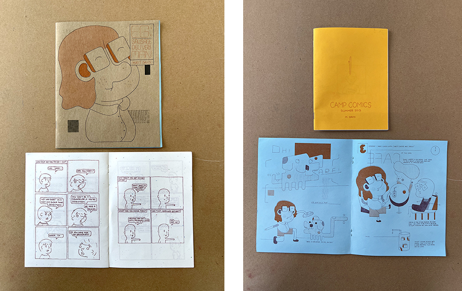
Prior to starting Perfectly Acceptable you were creating your own books. In 2014 you published Eg: Sausage Delivery Man. The book’s description is whimsical, “A joyful sausage delivery man has no problems going about his busy day”. Can you expand on this description in terms of your
process and the idea that gave rise to this effort?
When I moved to Chicago I was a dog walker. I was also pretty depressed; I went from my final year of Oberlin, where I felt like I was at something of a social and artistic zenith, to Chicago, where I basically knew no one and no one cared about my art. Eg was a character I had been doodling for awhile who was in a similar position as me but was of a completely different mentality. Rather than loathing his repetitive, boring job (not that dog walking is the worst you can do, I still recommend it to young artists) like I did, Eg embraced it and enjoyed every day to it’s fullest. The comic walks you through a day of Eg’s life, which is completely without conflict.
On a more literary level, I was interested in telling stories outside of the traditional narrative establishment-conflict-resolution arc. There’s already enough conflict, I thought to myself. How about something just nice? This thinking was also informed on some level by Virginia Woolf, ambient music, and the section of Neil Gaiman’s American Gods where the protagonist winds up in this Midwestern town and spends about a hundred pages just bumbling around with the plot progressing much. That kind of shit feels soooo good to my brain. I wish more people would play around with it.
Can you discuss why you decided to shift your attention from creating to publishing?
I have bad wrist problems that I couldn’t afford to get fixed preventing me from drawing the way I wanted to. I was still enamored with Risograph printing. Publishing was a way for me to continue experimenting with the Risograph, as well a way to still exercise creatively – even if indirectly.
My wrist still isn’t great, but I could probably draw more if I wanted to now. Still, I ended up finding that I loved the process of collaborating with artists & preferred to have my name on the back cover of a book, rather than the front. Drawing and putting out my own work always makes me anxious, especially with the advent of social media. I’m glad my artwork was spared Instagram, dealing with that horrible app is bad enough as it is with running the Press’s account – despite owing a lot of my business to it, haha.
You print most of your books in-house with a Risograph printer. What are some of the challenges working with this process? What flexibility ortechniques does this printing method(s) offer that cannot be achieved elsewhere?
Risographs are weird descendants of mimeograph machines, which used an ink covered cylinder with a stencil wrapped around it; the cylinder spins as paper is fed underneath, rubber rollers apply pressure between the drum and the paper, forcing ink through the stencil onto the paper. Most mimeographs involved a manual intervention (e.g. turning a lever to manually spin the cylinder and analog techniques for burning stencils). This is where the Risographs innovate. Risographs are fully automated, requiring just the press of a few buttons, all while offer reasonably sharp (300-600dpi) digital clarity, completely hands-off stencil-making, and, with later models, computer connectivity allowing you to send digital files directly to the press to create masters. And besides all that, they’re incredible cheap to operate (fractions of pennies per impression) as long as you’re printing a decent quantity (100+).
So basically, a great tool for zine and comix artists looking to self-publish. For me, beyond allowing me access to artistic mass production as a lowly Russian major locked out of the screenprinting building, Risographs allowed for rapid and relatively non-punishing experimenting, mistake-making, and exploration. Screenprinting takes too long to setup and printing isn’t exactly fast either, offset presses print fast as hell but take so long to setup it’s not even worth it unless you’re printing thousands – Risographs land in the delicate middle (good-ish, cheap, and fast), and always seemed perfect for autodidacts like myself who learn hands-on.
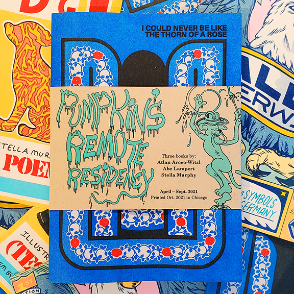
Risographs, also unlike mimeographs – or really most forms of printmaking in this day and age, are also completely proprietary, meaning you’re basically stuck with Riso Inc’s line of disposables – namely their unconventional, but nevertheless fun & vibrant, collection of ink colors. In Riso-Land there is no cyan, but Aqua or Cornflower; no magenta but instead Fluorescent Pink or Bubblegum. They are for the most part outside Pantone classification. There’s enough of them that it’s not really a problem, but it does require some novel problem-solving.
A quick aside: I have a semi-serious theory that most people understand art in relation to advertising: visual expression that is not selling a secondary product is art – and most people, especially those in cities, are able to subconsciously filter out advertising from their world to let only the good stuff in. Most printed advertising is done with CMYK inks (cyan, magenta, yellow, black), on white paper (either uncoated, or more often, coated – aka shiny) and although art is often ALSO reproduced with this same technique, I think people have a natural aversion to this sort of printing and will always be more receptive to things that appear new.
So therefore Risograph, with its goofy array of completely non-standard colors, thus is immediately exciting to the CMYK-weary eye. The inks are super vibrant and combine to make hundreds of colors that just wouldn’t look as rich produced with CMYK inks. I love pushing these colors to the limit, creating large, wonky gamuts of color – tailored to whatever I’m to be reproducing.
Are there any specific books that you have worked upon that you are genuinely proud of working upon?
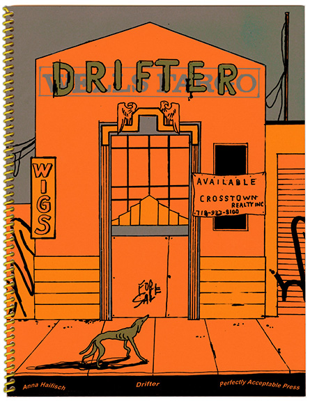
Anna Haifisch – Don’t Worry: This was the first book I did with Anna Haifisch. I met Anna at CAKE here in Chicago in 2015. She was visiting from Germany. I remember being floored by her screenprints and was so excited when she later agreed to publish a collection of them with me. Although Anna was an established cartoonist already, this was her first US publication. Working with her opened up a lot of doors for me in the international cartooning world (as well as a wonderful friendship with Anna).
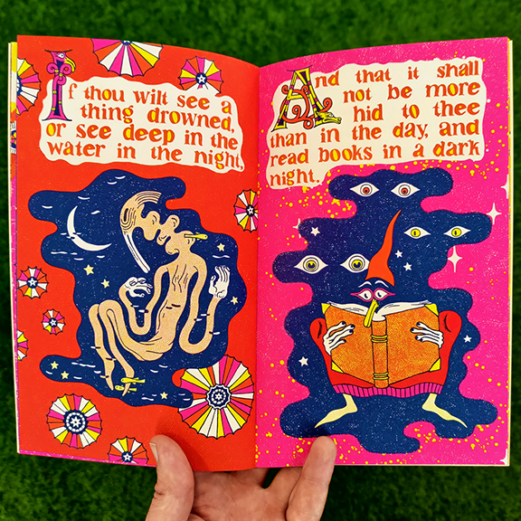
Daria Tessler – Accursed: Accursed was the second book I made with Daria. Daria seems to bring out the wildness in me as a publisher, because this book was bananas. It featured 4-color faux-CMYK printing (which I had just begun to master), a 26″ center foldout (which required a bit of hacking to get through the Riso), a foil stamp & die cut cover, and pamphlet stitched binding – the thread of which attached a two little bells to each book. Just an all-out bananas book that I think a lot of people took note of. I think my books are a little more tame these days, but I hope to recapture this energy some day, because that sort of zine-boundary-stretching type of design is super exciting to me.
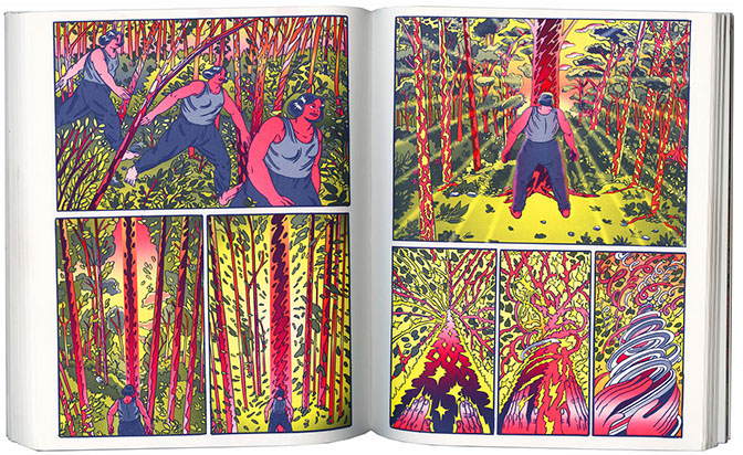
Margot Ferrick – Dognurse & Lale Westvind – Grip vol. 1: These books came out at the same time and were launched together at an event at Printed Matter, Inc. in NYC. Margot was the first artist I ever published, and this was their second book with me. The story and art really blew me away, and it ended up being a production similar to Accursed, where I did everything I could to make it special. Grip vol. 1 was my first title with Lale, but Lale really knocked it out of the park (and then some) with the art and story. Lale would later finish the second volume of Grip and we would collect it as an offset title which was a big deal in it’s own right. But the reason I include these here is because the launch at Printed Matter felt like a big stepping stone – when I realized my books could draw a crowd in a city beside my own, and in a store as “fancy” as Printed Matter.
What are you currently working upon? Do you have any upcoming publishing projects we should be looking out for?
Everything’s kind of backed up these days because I’ve been having months of technical troubles with my Risograph, but the upcoming projects are:
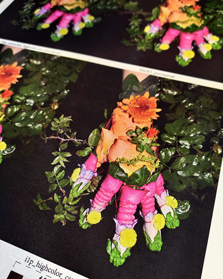
Cryptid by Colette Stubbings – Colette makes really amazing ‘armor’ made out of flower petals and other organic matter that she wears gloves & photographs. I like her work because it defies categorization: is it fashion? photography? sculpture? And now: a book? Cryptid is a collection of her photos that I’m printing with a new-to-me 6-color process that I’m really excited about. It’s a major undertaking, so I’m taking my time with it.
Professor’s Day Off by Alex Graham – Alex Graham’s comics have always made me feel things, and her serialized webcomic Dog Biscuits from 2020 was some of the best cartooning I have seen, and have wanted to work with Alex ever since reading it. Professor’s Day Off is a one-off story Alex wrote that I absolutely loved.
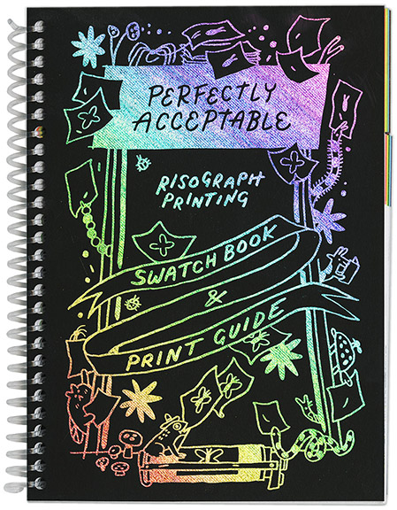
I’m also working on the new edition of my Risograph Print Guide, illustrated by Natalie Andrewson. This one has really ended up on the backburner, but I hope this Fall I’ll be able to wrap it up and have it out for the holidays. The first edition was a hit, and this new edition will be bigger, better, and more universally applicable than ever before!
For additional information on Perfectly Acceptable Press and Risograph Studio and other related materials, please visit:
Perfectly Acceptable Press and Risograph Studio – http://perfectly-acceptable.com/
Perfectly Acceptable on Instagram – https://www.instagram.com/perfectlyacceptable/?hl=en
Perfectly Acceptable on Facebook – https://www.facebook.com/perfectlyacceptable/
Mason Exhibitions – https://www.masonexhibitions.org/exhibitions/perfectly-acceptable
Printed Matter – https://www.printedmatter.org/catalog/53937/
Paper Cuts – https://papercutszines.com/perfectlyacceptable-issuepress-narc/tag/Riso
LVL3 – https://lvl3official.com/spotlight-perfectly-acceptable-press/
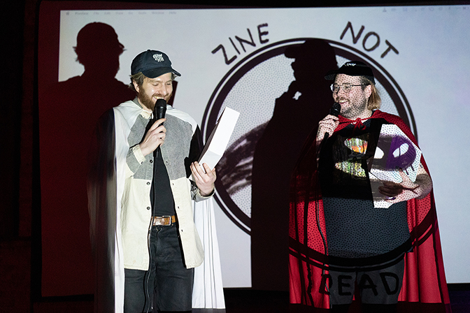
Zine Not Dead – http://www.zinenotdead.com/
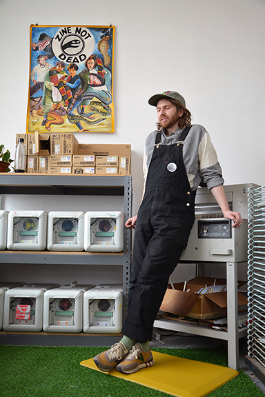
Artist interview and portrait by Chester Alamo-Costello


