Milton Glaser was born on June 26, 1929, Bronx, New York, and was an American graphic designer, illustrator, and cofounder of the revolutionary Pushpin Studio. Glaser attended the High School of Music and Art and the Cooper Union art school in New York and, the Academy of Fine Arts in Bologna, Italy. Throughout his career Milton Glaser was a renowned designer of posters and print with his work being included in art exhibits around the world. Famous for his iconic I heart NY logo that is a staple of New York merchandise and his Bob Dylan poster. He would go on to receive the 2004 Lifetime Achievement Award from the Smithsonian Cooper-Hewitt, National Design Museum, for his outstanding and meaningful contribution to the contemporary practice of design.
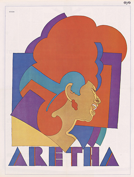
This poster was created by Glaser for the November 1968 issue of the youth culture-focused Eye Magazine, published by the Hearst Corporation. During this time, Martin Luther King, Jr. presented Franklin with an award from the Southern Christian Leadership Conference during one of her concerts in Detroit for her iconic gospel singing. This poster compares to the psychedelic postmodern posters of the 1970’s with its use of abstract organic and geometric shapes with bright, exciting colours that convey the image of Aretha Franklin putting her all into singing soul. The use of cool and warm colours really mix well and contrast with each other. The white background really enhances the image as focal point with the inclusion of the organic shapes full with opaque bright colours. The type fits perfectly with the image as it too is constructed out of simple geometric shapes that utilise vibrant orange line to accent the dark cool shapes of the letters.
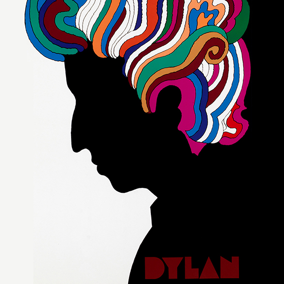
John Berg, who was the art director at Columbia Records back in the late 60’s, asked Glaser to create a poster to be folded and packaged into Dylan’s “Greatest Hits” LP. This poster was an illustration of the iconic Bob Dylan which captured the psychedelic charm of the so-called flower-power era of the late 60’s and early 70’s. It would become one of the most widely circulated of all time; six million or more were distributed with the enormously popular album.
With the modernistic “less is more” approach Glaser created a silhouette of Dylan with a flow of vivid colors and organic shapes that matched the hairstyle of Dylan making it a focal point of the poster. The hierarchy of the poster has you fixated on his hair that leads you down the silhouette to the simple geometric type that states Dylan’s name. The type coincides with the idea of less is more as it is reduced to simple shapes.
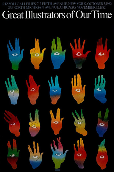
Glaser was commissioned to create a poster for the Rizzoli galleries located in New York during the 1980’s. This gallery showcased a vast amount of famous illustrators and their work. Glaser wanted to represent illustration being the product of the eyes and hands working together. The incorporation of the illustration of the hands with the eyes in the palm symbolises the many illustrators featured in this show. The inclusion of the different vibrant colours and hand signals represent each illustrator’s style and approaches they have contributed to the exhibits. The hierarchy of this poster has the viewer’s gaze towards the type at the top of the poster which leads down to the images of the hands. The black background gives a bold contrast to the bright colours of the image and the white of the text.
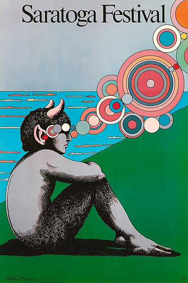
This poster was created for the 1980 Saratoga arts festival in upstate New York. Glaser included a satyr sitting lakeside with these circular shapes floating almost into the satyr’s ear as if he is sitting down taking in and listening to the music. Milton includes his iconic satyr in this poster which he has a certain fascination with as he’s incorporated them into a few other of his pieces. Milton includes the satyr as an illustration done with a fair amount of detail and shading heavily using cross hatching to bring detail to the figure. Besides that the rest of the image goes with the more common style of the psychedelic poster design of the time. The bubbles of soft pinks and purples gives the sound of music a physical form as it makes it way to the listener. The warm yellows and oranges give off the reflection of the sun on the lake with the solid blue background of the sky. The type uses a bold serif type to advertise the festival and immediately draws the viewer’s eyes down to the image.
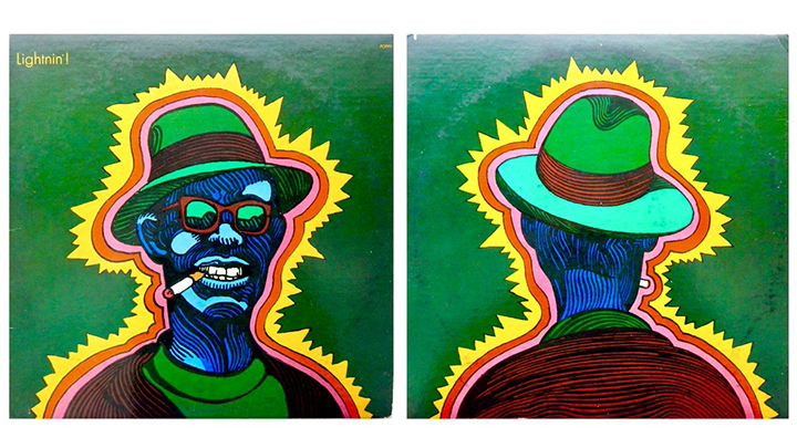
Milton created dozens of album covers over the years and really had an influence on the design of cover art. For instance, he would create a custom type for an album that he would later turn into a font. He would then use that font on other materials, and then other designers would use it on their own albums covers. This cover draws inspiration from the psychedelic post-modern era of the 70’s. The use of flashy colors with dark backgrounds to contrast the image really makes the cover pop. The use of black lines gives the figure in the main image a texture to the characters skin.
For additional information on the graphic design of Milton Glaser, Please visit:
Milton Glaser – https://www.miltonglaser.com/
Dezeen – https://www.dezeen.com/2020/07/01/milton-glaser-graphic-design-roundup/
New York Times – https://www.nytimes.com/2020/06/26/obituaries/milton-glaser-dead.html
Creative Boom – https://www.creativeboom.com/features/milton-glaser/
Analysis and writing by Daniel Burgess. In addition to his fascination with music, as a graphic design major Burgess holds high interest in understanding how various art forms (fine to utilitarian) intersect. In addition to interest in visual culture and music, Burgess probably plays a bit too much Destiny in his spare time.


