Revisiting Matt Siber’s Floating Logos
by Madison Scheel
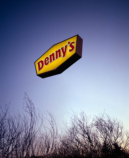
I was first introduced to Matt Siber’s Floating Logos series in a color photography course this fall. The rich color of the images are dotted with floating icons identifying advertising practices commonly found in the Midwest. “Denny’s”, 2005, struck me initially. The vibrant deep purple of the sky is complemented with the yellow face and stylized red text of the Denny’s sign. The absence of support initiates a pause due to the lack of any pole or stanchion propping the signage up. The sign appears to be floating out in the middle of nowhere. This optical conundrum makes it that much more unique and intriguing to look at. The trees at the bottom are slightly blurred which makes the sign more pronounced. Siber states, ” Making the signs appear to float not only draws attention to this type of signage but also gives them, and the companies that put them there, an otherworldly quality. References can be drawn to religious iconography, the supernatural, popular notions of extraterrestrials, or science fiction films such as Blade Runner. Each of these references refer to something that can profoundly affect our lives yet is just beyond our control and comprehension.” This thoughtful reflection established my interest to further analyze this artist’s investigations.

Matt Siber, Denny’s, 2005
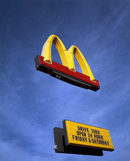
The omnipresent golden arches has come to define the American fast food experience. Perhaps, the most common sign one will encounter will traversing the Chicagoland highways, McDonald’s simple design is remarkably memorable. Often, we are seduced into making that pitstop to refuel, even when unnecessary. Again, in “McDonald’s”, 2003, the technical approach is replicated. The golden arches is suspended above a placard that indicates that the restaurant’s drive thru is open 24 hours on Fridays and Saturdays. There is a bit of irony when considering the rich colors of the imagery and the cleanness in Siber’s art with the idea that one can pull in for a quickly produced burger, fries, and shake in the late hours of the night.

Matt Siber, McDonald’s. 2003
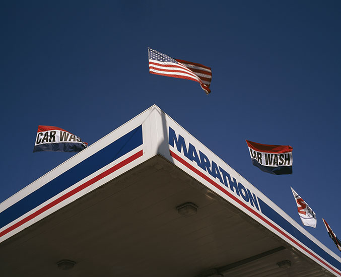
Another image, “Marathon”, 2004, provides the same technical approach in freely suspending items of attention, yet here the focus is upon floating flags above a roadside gas station. This image immediately stands out due to the patriotic use of color (red, white, and blue), the same colors as our country’s flag. This theme gives the image a more powerful meaning due to invoking a sense of patriotism for our country. This idea is enhanced through Siber capturing the flags in motion, rather than the static stillness found in much of his other images. An opaque cloudless blue sky at top is contrasted with the muted underbelly of the covering that protects from the elements the pumps and those refueling. The composition focuses the viewer’s attention squarely upon the American flag flanked by smaller flags, including two that indicate a car wash. When considering this image at present I cannot help but contemplate the artist’s intention. The use of color and flowing flags gives of a sense of fleeting ideas. There are a number of readings one can take from this image (and series).

Matt Siber, Marathon, 2004
Matt Siber is an artist and educator living in Chicago. His artistic investigation focuses upon formats of communication, both physical and psychological. In addition to his photographic practice, Siber creates sculptural works that remind of early 20th century art while advancing contemporrary art practices. His work has been exhibited frequently in the United States and Europe and is held in numerous collections, including the Art Institute of Chicago, the Museum of Contemporary Photography, the Aaron Siskind Foundation Fellows Collection at Princeton University, and the COFF Foundation in San Sebastián, Spain.
Source: Matt Siber – http://siberart.com/


