There is clear evidence that Unyimeabasi Udoh understands the interrelation of image + text + language and the implications that ensue. From a seemingly simplistic use of appropriation in typographic selection to needlework that draws upon intimate scale and tactile experience, Udoh’s communications are fluid, free, open ended, and, at times, quite direct. Upon further inspection one can see in this highly distilled practice, the application and results offer visual content/experience in thoughtfully measured doses. This week the COMP Magazine traveled up to Ravenswood via the Brown Line to discuss with Udoh their selection of hands-on process versus digital application, how Covid-19 impacted their process, the colour black, voids, and society’s constructs that have defined these items over time, and the print publication “Plates” created with Casey Carsel.
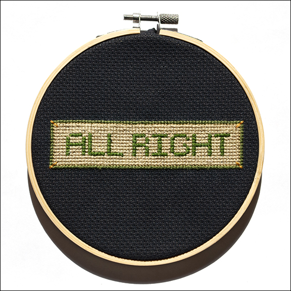
Thank you, you are the first artist’s studio I have visited since before the Covid-19 lockdown. I’m wondering if you can share with us how you see your practice being impacted by recent events? Did you see any shifts in how you work? Advancements in how you use technology? Or new ideas or investigations that surfaced?
I actually didn’t have a studio at all until November 2020. I spent the first part of the pandemic embroidering in my living room and cutting garlands in my kitchen. A friend moved in the fall, and I ended up taking over his studio, which allowed me to work outside of my home for the first time since leaving grad school.
Having a separate studio space has let me work at scales and with mediums that I couldn’t at home—there wasn’t space, for example, to safely pour resin in my shared one-bedroom apartment. I can work on multiple projects in different stages without having to put all of my supplies away every time I pause or switch tracks.
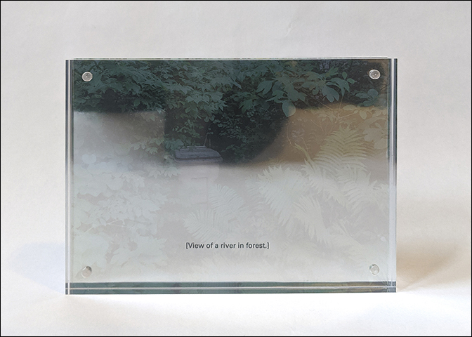
Upon initial glance I sensed you draw insight from an array of seeming disparate backgrounds and ideas (traditional high modernism to new approaches in typographic design to often overlooked art forms like fiber arts). I feel my cursory reading is inadequate upon further contemplation. I’m curious if you can present a summary of your aesthetic practice in terms of how conceptual investigations and tactile process intersect?
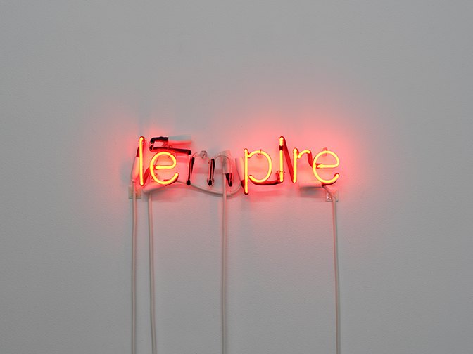
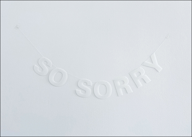
I’m interested in the construction of systems of knowledge and communication. Text and language are a big part of how we transmit knowledge, and I explore these both formally and conceptually. The idea of text as image, and the relationship between typographic form and content, are two things that drive a lot of my work. To this end, I’m a bit medium-agnostic, switching from print to installation to embroidery depending on what best serves the piece. Oftentimes my text works appropriate or recontextualize extant containers for language, like signage, embroidery hooplas, or party garlands.
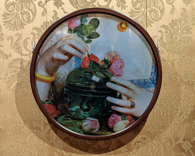
Though my medium changes, I find myself drawn to the same kinds of surface effects: my work is often low-contrast, monochromatic, reflective, or all three. In my text-centric work as well as other areas of my practice (I also make work that appropriates canonical images and texts, along with work that is more fully abstract), these appearances contribute to an aesthetic of withholding, a way to foreground the opacity and absurdity of the structure of our world.
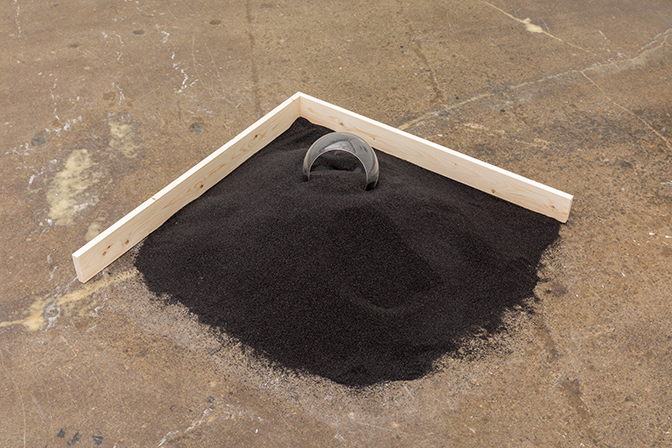
Can we talk about the color black and our society’s understanding of voids? Often the color black and interpretations of voids are defined in terms of emptiness, darkness, and negative space. In drawings posted in your studio and our conversation I sensed my reading being a limited interpretation. Can you share with us your interest and interpretation in these items?
I’m not sure I can sum up the void so easily! Investigating it undergirds much—and perhaps all—of my practice. The void, and the color black, encompasses negation as well as omnipresence, opacity and ubiquity. It’s intertwined with my interest in systems and/of communication as well as the formal aspects of my work. It’s looking at multiple readings of the phrase “nothing matters.”
In recent time, I’ve noticed a rise in interest, application and expansion in fiber arts and needlework. You have been creating a series of text-based artworks in this medium. I see an intimacy in approach and scale. Can you describe your intent and process?
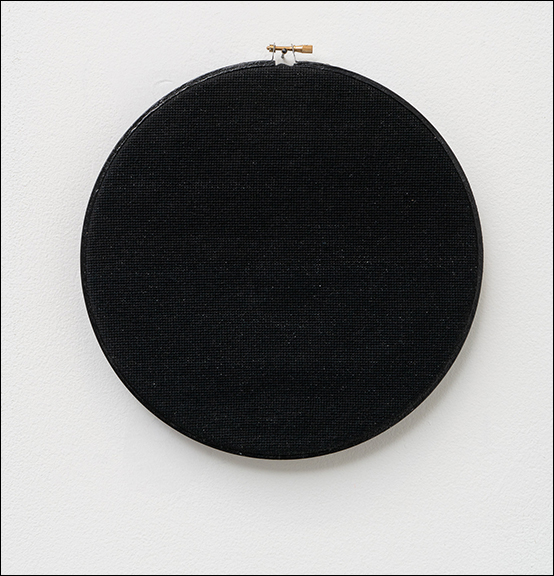
I started making my cross-stitch embroideries several years ago; I had developed a grid-based display alphabet and wanted an application for it that was grid-based as well. Now, I see my embroideries as a way of literally rendering text, embodying the absurdity of spending a large amount of time on a short, banal bit of language—or, in the case of my embroideries without text, spending that time to produce nothing.
What do you value most in your aesthetic practice?
Conveying a sense of lack, that something is missing or obscured in what otherwise appears legible (literally or metaphorically) is very important to me. Humor is also important. It’s easy to be dour about much of my subject matter and conceptual concerns, but I do love a good pun.
You’ve discussed the publication “Plates” previously in other publications; however, I am hoping you will revisit this effort here. What prompted this format for dissemination? What are future plans for this publication?
I started Plates with my friend Casey Carsel; we had worked together on F Newsmagazine, the student paper at the School of the Art Institute of Chicago. We enjoyed publishing (about) art and the technical aspects of running a print publication, so we decided to try it on our own. Plates was conceived as print-first, so we put a lot into that end of things and aimed to make our website a complement to the primary print experience. As I write this, we’re about to publish our fifth issue, and find ourselves at something of a crossroads. We’re not sure what form Plates will take in the new year, but print is very important to both of us.
For additional information on the aesthetic practice of Unyimeabasi Udoh, please visit:
Unyimeabasi Udoh website – https://unyi.me/
Unyimeabasi Udoh instagram – https://www.instagram.com/_ultrabasic/
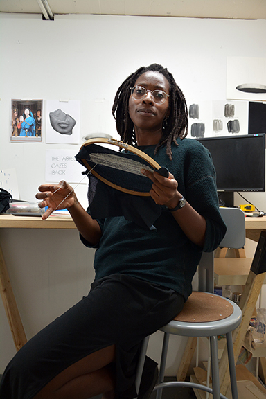
Interview and portrait by Chester Alamo-Costello


